Bitget Homepage Redesign
Taking the brand from 2D to 3D, on the page that earns sign-ups
The redesign of Bitget’s web homepage was my first major project after joining, launched to all users on 26 November 2024. The homepage is the front door for visitors who have not yet signed up, so its job was unambiguous: convert them into registered users and app downloads.
I owned the project end to end: the initial research, the design and its delivery through launch, and the data analysis that followed. The visual direction it set went on to become the foundation of Bitget’s design system.
Visit the live site (opens in a new tab)
- Role
- ResearchVisual directionUI & UX designMotionData analysis
- Platform
- Website
- Duration
- –
- Date
- Nov 2024
What the research said
The redesign started from evidence rather than taste. A survey gathered 808 pieces of feedback on the two homepages Bitget ran at the time: 421 on the marketing version and 387 on the simple one. The simple version read as generic, unfriendly and without a clear focus. The marketing version read as cluttered, casino-like, hard to read and overloaded.
From that, the proposal set three goals: remove friction from sign-up for new users, make the path to the app clearer, and cut visual noise so the brand, and its security, read as trustworthy.
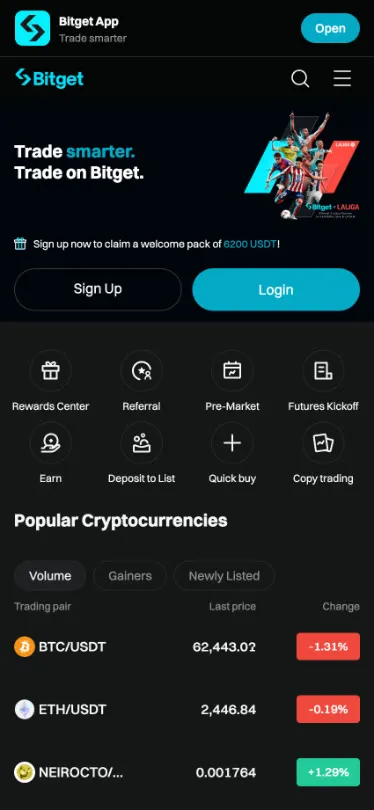
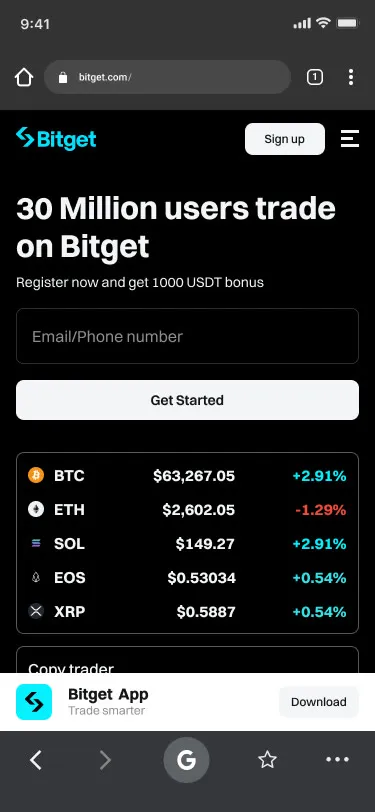
Behaviour data decided where things went. Mobile accounted for 66.2% of homepage visitors (desktop 32.6%, tablet 1.2%), and fewer than 3.6% of visitors reached the bottom of the long page. Sign-up and the key product information had to move up, and the mobile version had to be designed in its own right rather than shrunk from desktop.
Three decisions
The proposal turned those findings into three changes. The comparisons below come from that proposal.
- Navigation. The top bar carried an icon, nine main items and an ad slot, ten or eleven entries in all. Copy trading and bots moved under Trade, a Learn entry was added for newcomers, Rewards was given more prominence, and the second- and third-level menus were trimmed.
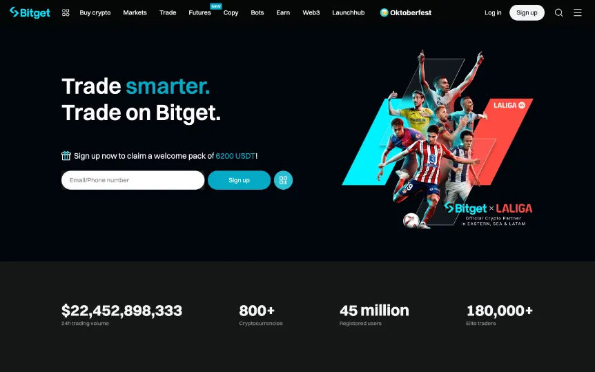
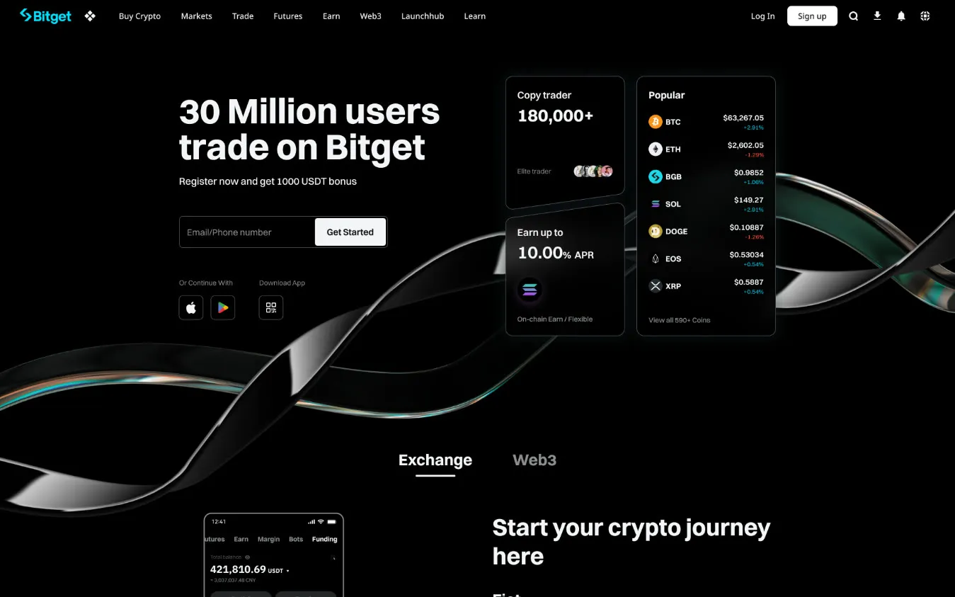
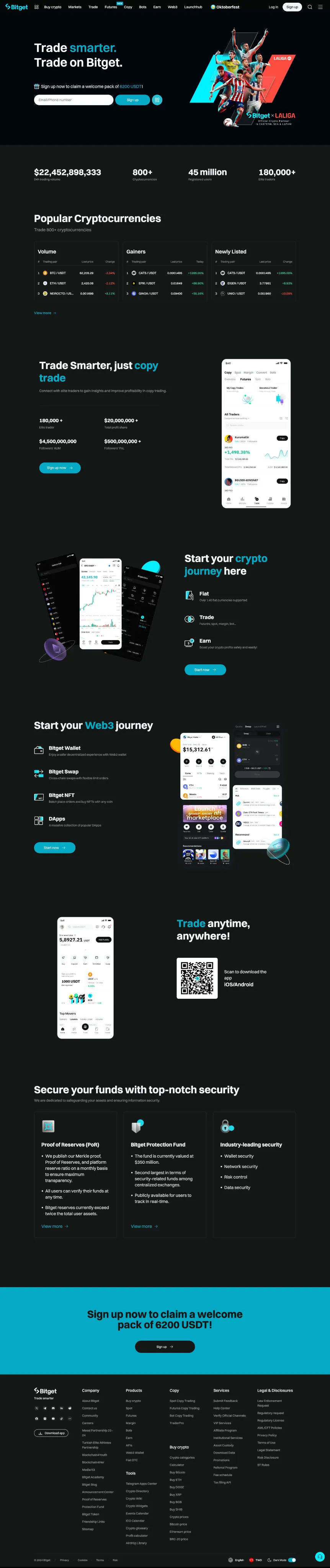
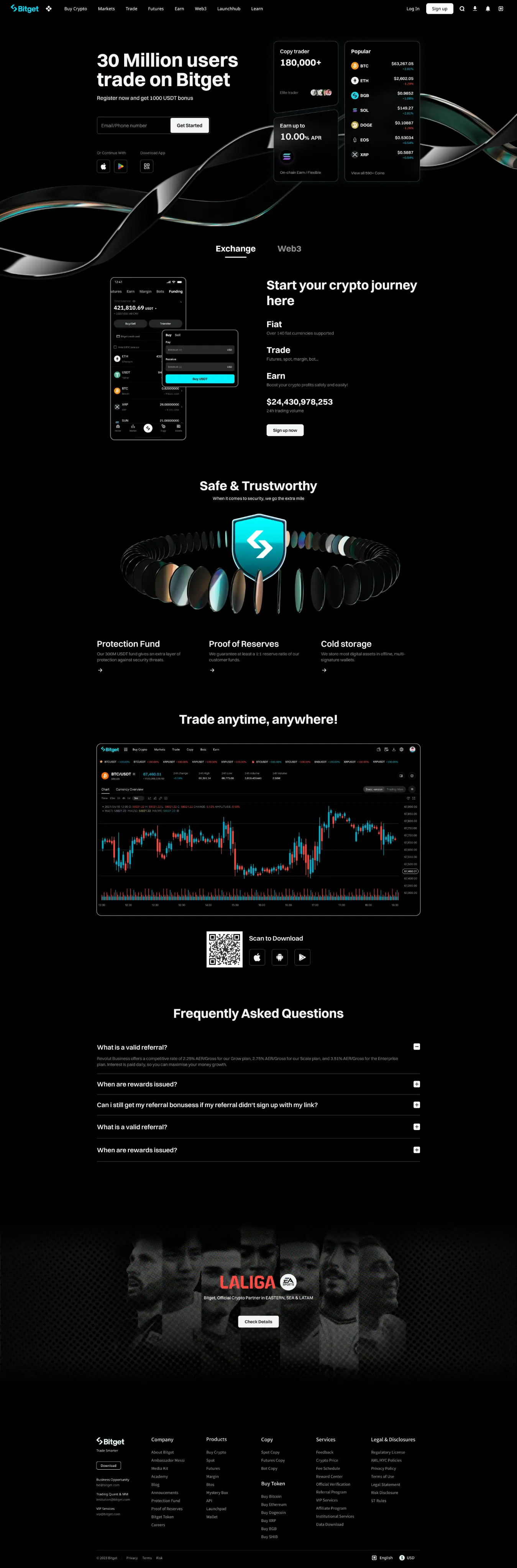
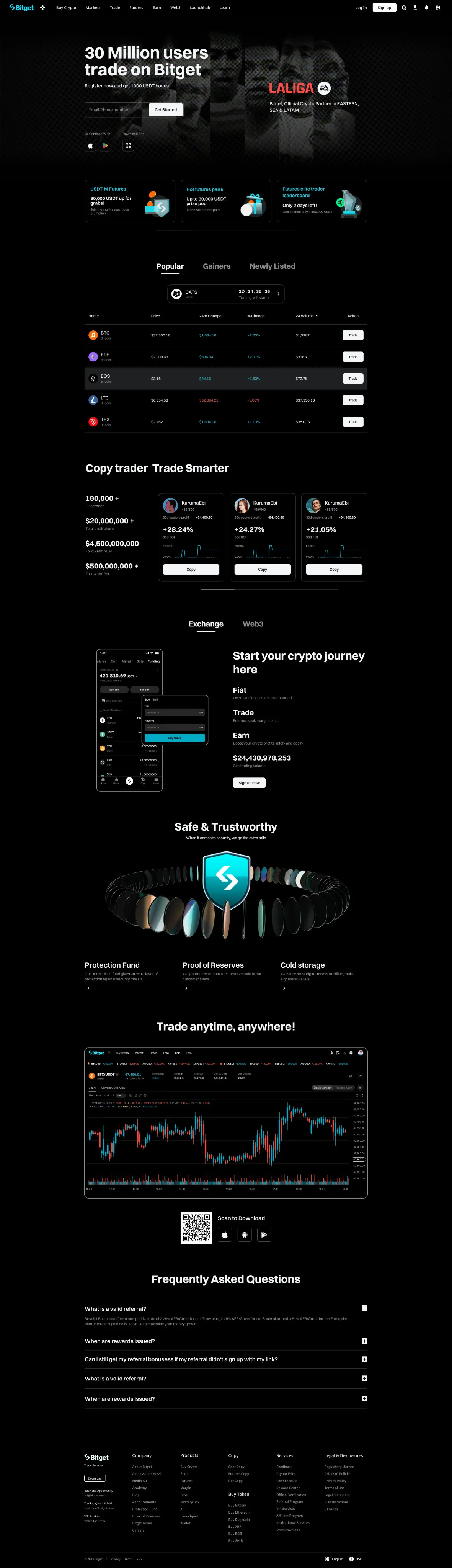
- Simple version. The page went from more than eight screens to five, so more visitors reach what matters: popular coins, copy trading and earn rates moved up, overlapping business and trust modules were merged, and an FAQ was added.
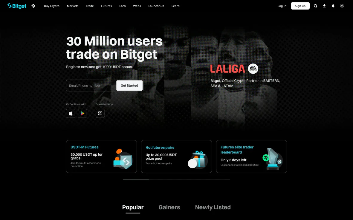
- Marketing version. The first screen keeps the campaign but loses the clutter, with micro-motion for emphasis; market data sits in tabs, and copy trading shows three traders at once.
Simple version
Before on the left, after on the right. The full pages below scroll like the live site.
Marketing version
The full page below scrolls like the live site.
Mobile web (H5)
Before on the left, after on the right, at phone size.
From 2D to 3D
Bitget’s visual language was built on flat, 2D gradient textures. I moved it into three dimensions and treated glass as a physical material rather than a surface effect, working out its refraction, flare, transparency and lighting in detail.
To let the material carry the page, everything around it was deliberately restrained. I defined rules for typography and corner radius that keep the interface calm and consistent, so the 3D visuals lead without competing with the content.
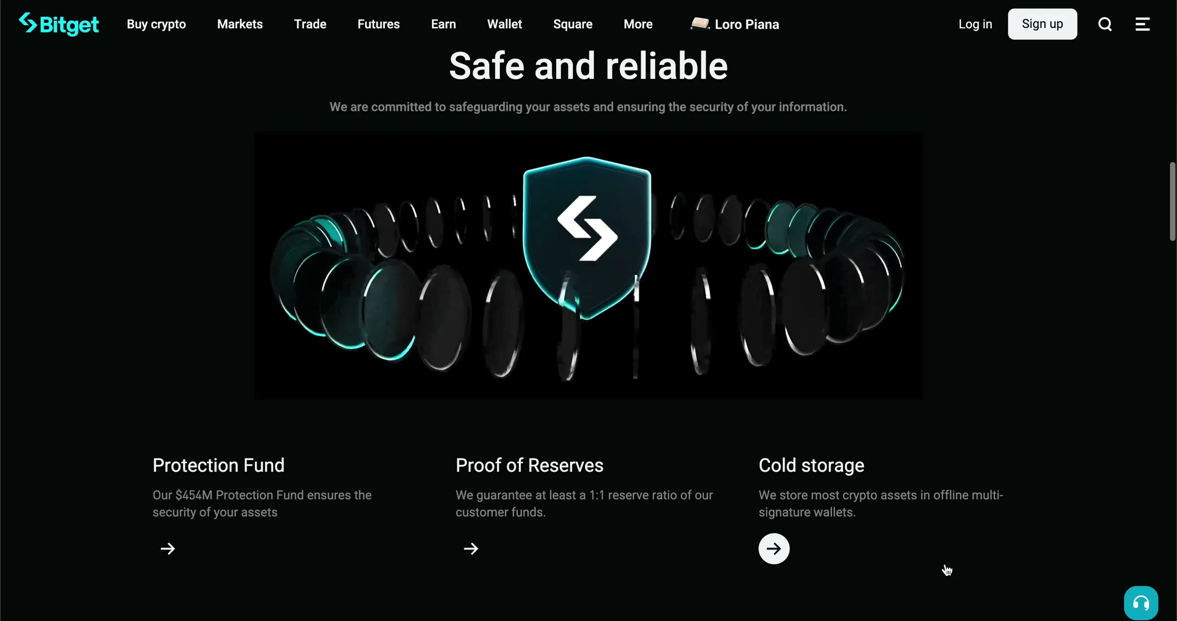
The work extended well beyond a single page. These rules became the groundwork for Bitget’s design system, and the starting point for the key visuals and large-scale pages that followed.
Effect versus speed
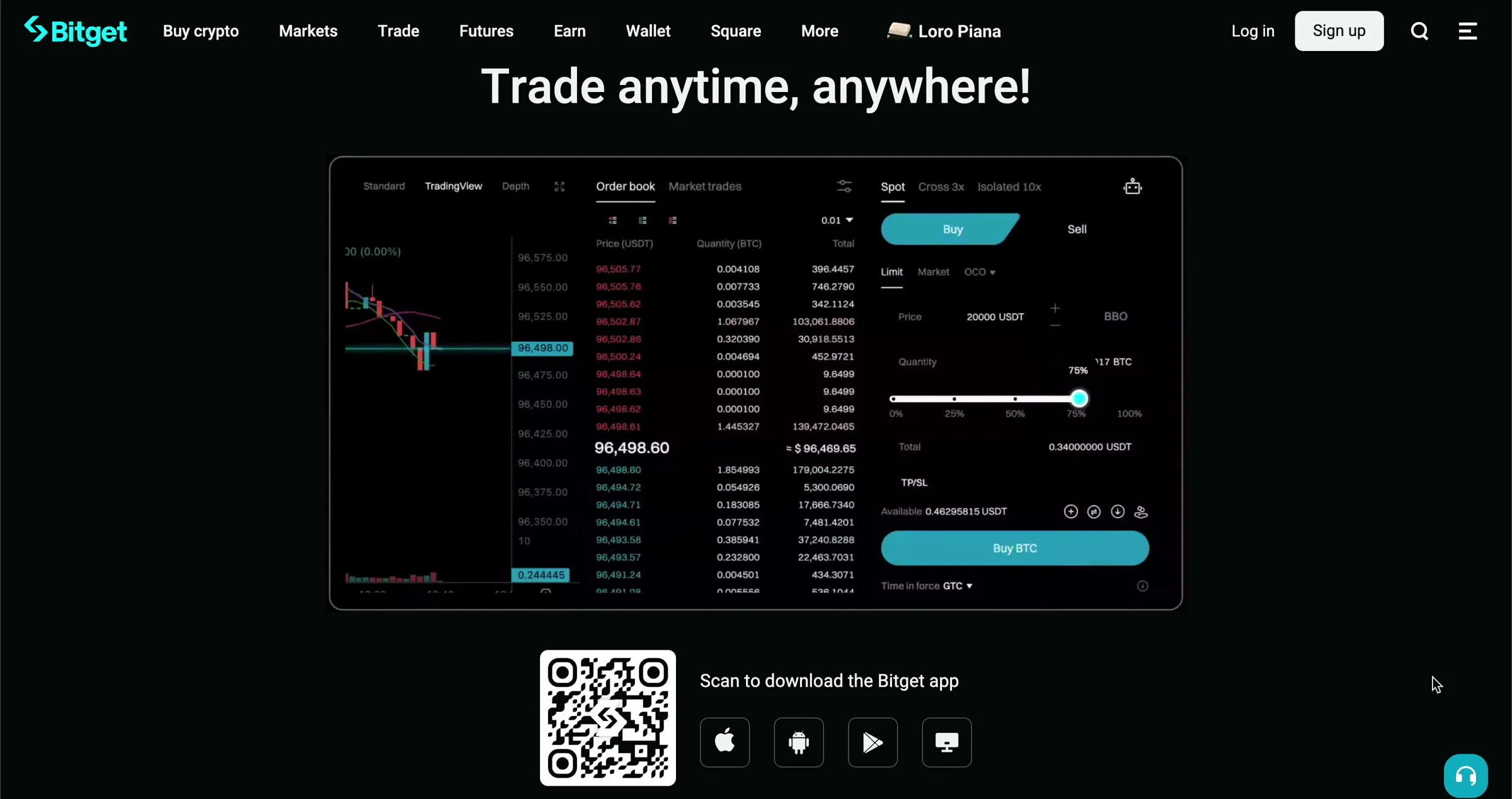
The homepage is one of the most performance-sensitive pages on the site, yet the design called for rich 3D motion. Rather than cut the motion, we kept it by compressing the assets into lighter file formats. The trade-off was duration: the videos were shortened so that each forms a clean, seamless loop while staying small enough to load quickly.
After launch
- Homepage sign-up conversionAverage rate
- +83.61%
- App download conversion
- +14.63%
- First-screen sign-up button click rateDaily average
- 0.47% → 2.47%
- Users clicking the app download areaDaily average
- 39 → 304
Before launch: 16 Sep – 24 Nov 2024. After: 26 Nov – 16 Dec 2024.
Figures to be confirmed before launch
What the numbers don’t say
Homepage traffic grew sharply over the same months: visitors who registered from the homepage went from about 34,000 in September to about 229,000 in November. That is why the results above are rates, not totals. They are still a before-and-after comparison, not an A/B test, so they include more than the design.
Feedback was not all positive. In a post-launch email survey of English-speaking users (2,933 responses), average satisfaction was 4.22 out of 5. The 313 negative answers were mostly about a steeper learning curve, weaker Korean support, a missing KRW display and dark mode.