Leading Finance Design at Gate
Learning a crypto finance product line, redesigning the app’s Earn page, and leading the team through it
I spent six months at Gate as the design lead for the finance product line: earning products such as savings, dual currency, structured products and ETH staking, plus collateralized borrowing, trading bots and copy trading. This page covers how I got to know those products, the redesign of the Earn home page in the app’s 3.1 release, and how I led the team around it.
I designed the Earn home page myself. The Loan and Startup pages were designed by members of my team, and my part was the direction and the review.
- Role
- Product auditApp UI & UX designCompetitor researchDesign leadership
- Scope
- Finance product line
- Duration
- 6 months
- Date
- 2024
Learning the product line first
Finance products are hard to design for because one label can hide very different risks. In my first weeks I mapped the line into four areas: earn, borrowing, quant trading, and the rest, such as pay and rebates. For each product I wrote down who it is for: someone new to crypto, an intermediate investor, or an advanced one.
Then I used every product as a user on web, iOS and Android, and wrote down what I found.
- Flexible savings had copy errors, extra information, and a different information structure on web and in the app.
- Structured products had inconsistent colors and icons, and no obvious place to find trade history.
- An older savings product had no responsive layout, and most of its content repeated the new Earn page.
The report ended with the questions the redesign had to answer. Should the app recommend by coin or by product? How should entries and paths be rebuilt? Should the older product stay at all?
The navigation had the same problem
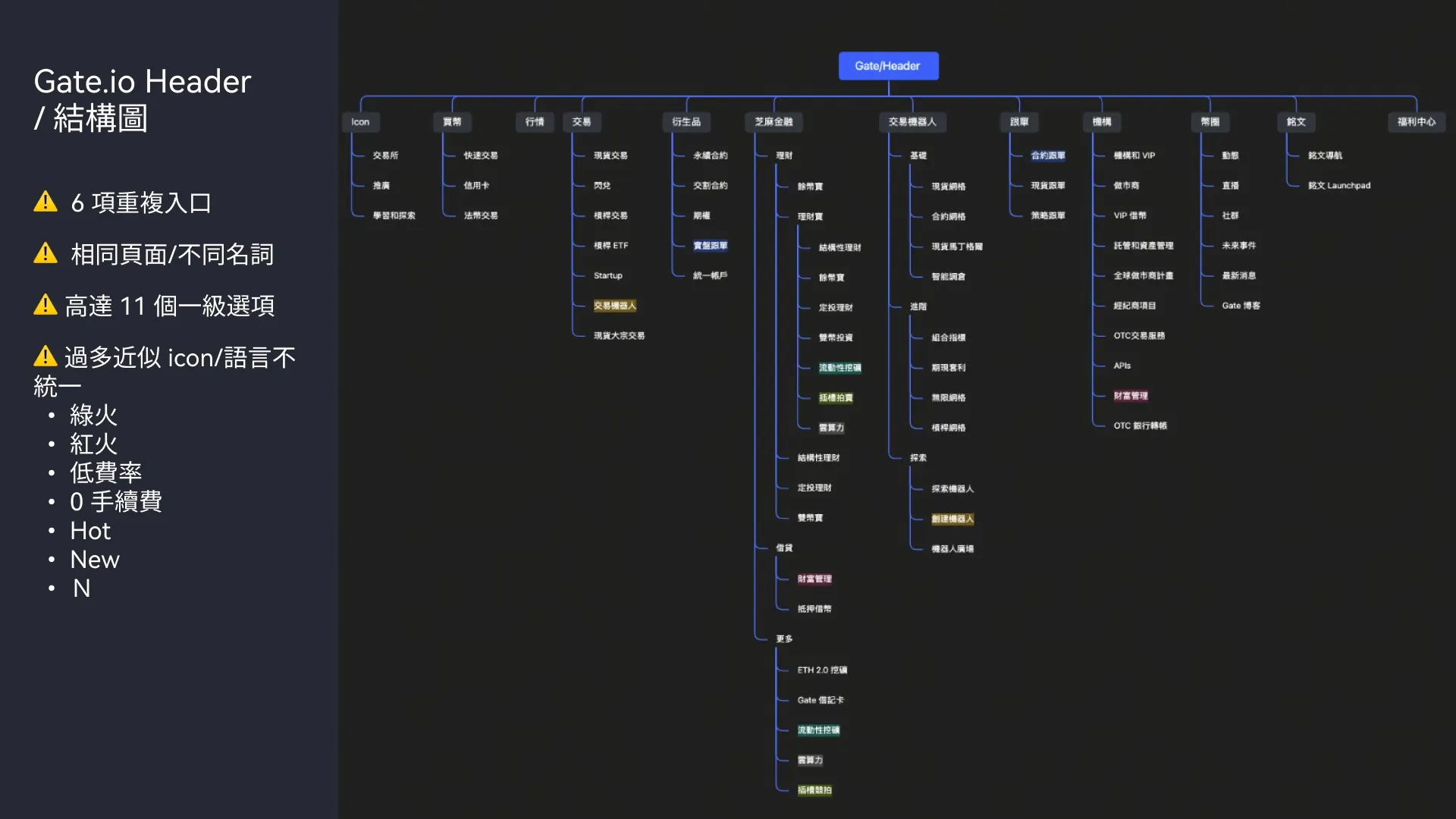
I compared the headers of four exchanges, from the busiest to the simplest. Gate’s had eleven top-level options, six repeated entries, the same page under different names, and a pile of near-identical badges: a green flame, a red flame, low fee, zero fee, Hot, New.
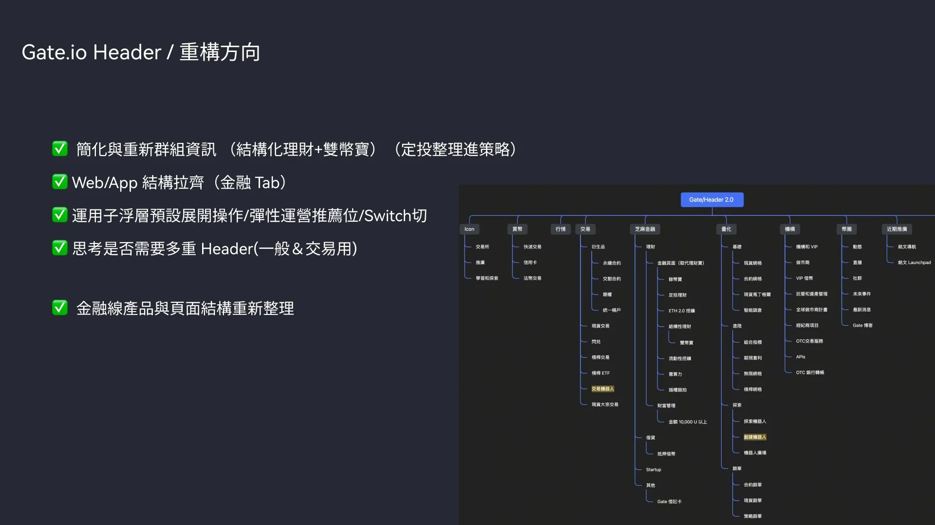
The others each had something to learn from. OKX had cut its header down to eight items. Bybit’s trading flyout led straight to a trading pair. Bitget used a drop-down flyout for operations slots.
I wrote the direction down as four points: regroup related products, such as structured products with dual currency, and fold auto-invest into strategies; align the finance tab on web and in the app; use flyouts that open with the main action and leave room for operations slots; and decide whether trading pages and general pages need different headers.
What the Earn page should do
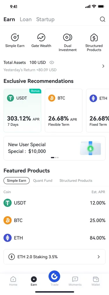
The first question was how people find a product. One logic starts from the coin: if you hold USDT, show the best rate for USDT and let a tap open every product for it. The other ignores product names and sorts by risk: low risk, high yield sorted by rate, and structured products. We looked at how competitors, OKX in particular, handled each.
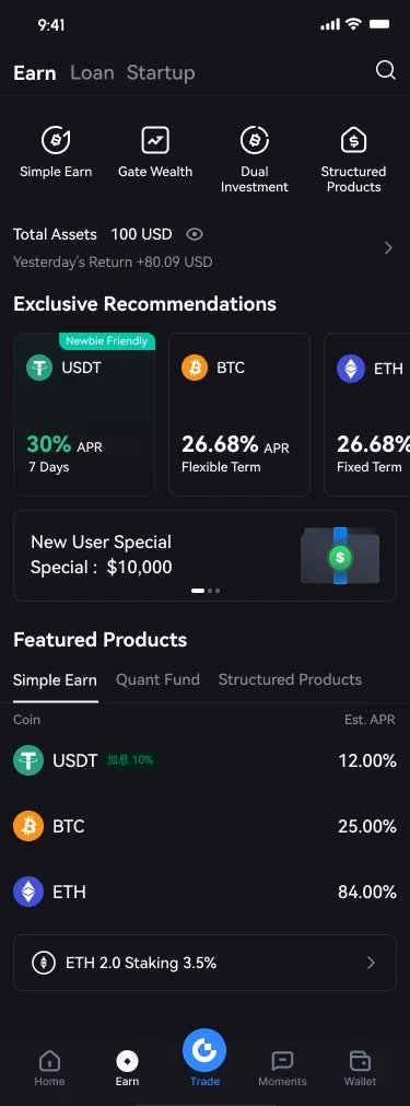
We chose using our own data and the competitor comparison, not by preference. The page that shipped uses both: coin recommendations at the top, and product-type tabs below.
In the proposal, three choices came straight from data:
- Shortcuts. Which products get a shortcut at the top was decided by page views and unique visitors.
- A smaller banner. I looked at how operations slots performed on the homepage and the savings pages, and shrank the banner to use the vertical space better.
- Order. Products were ordered by business importance, performance, and how high the entry threshold is.
A spec engineers can build from
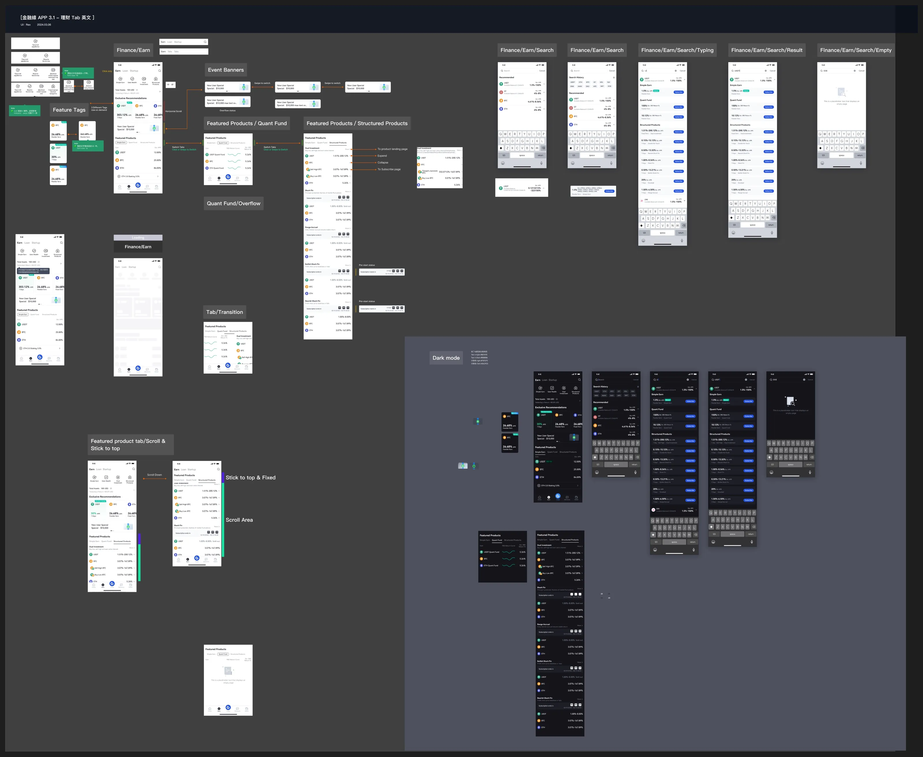
The 3.1 release moved the app to Flutter, so the spec could not leave anything to guess. The board below covers the home page; banners that swipe or tap; three kinds of tags, used only when needed; the three product tabs with their overflow and pre-start states; a loading skeleton; tab transitions; a tab bar that sticks to the top while the list scrolls; search; and dark mode.
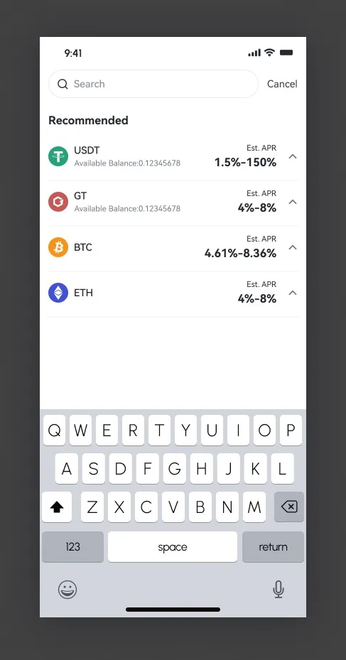
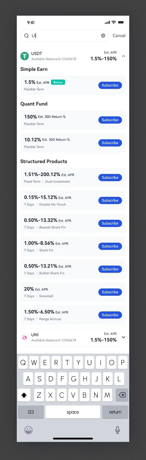
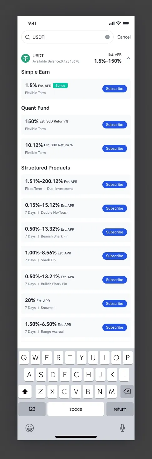
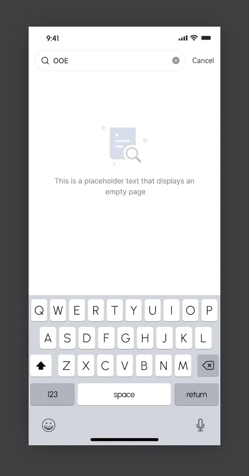
Search opens with recommended coins and history, then narrows as you type. A coin expands to show the products you can buy for it.
Directing the rest of the app
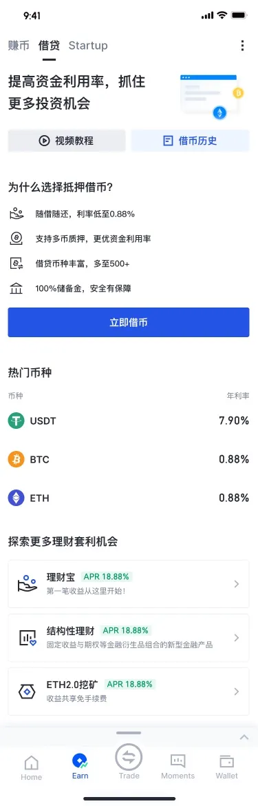
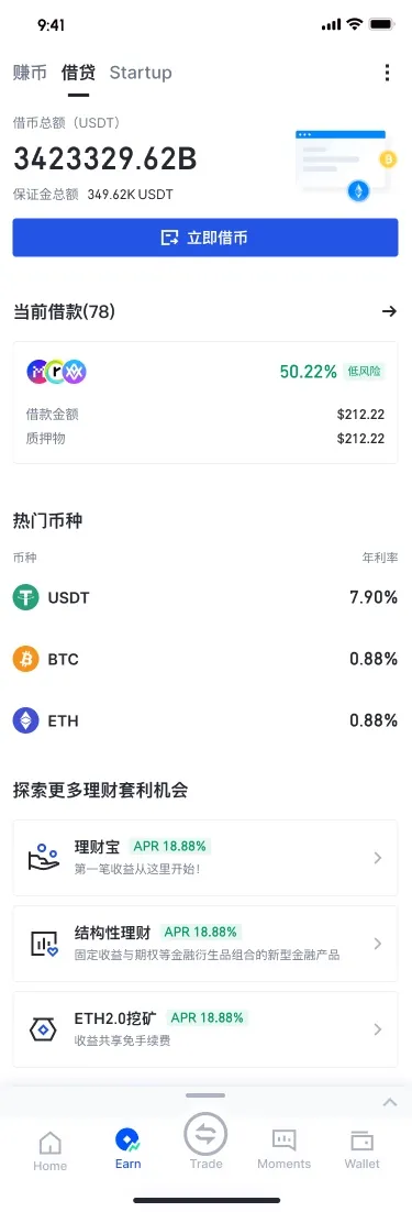
Members of my team designed the Loan and Startup pages. I set the direction and reviewed the work.
For Loan, the page follows where the user is: has never borrowed, has borrowed before, or holds a position now. We simplified the position list, put the collateral ratio first, added a position detail page, and moved the actions people use most to the front, based on behavior data. For Startup, we cut the header down, enlarged the subscribe button, and removed noise from the cards so the main action stands out.
Measuring what shipped
I wrote the finance team’s weekly review and a monthly comparison for every product line. After a release I compared like periods, and for each movement I wrote down whether the market, an operations campaign or the design most likely caused it.
Dual-currency subscription is a good example, although a team member designed it. Two weeks after the new flow shipped, conversion rose 12.5% on Android and 19.5% on iOS. We named two kinds of reasons and kept them apart: the experience, which split the flow into steps and moved to the new Flutter build, and the product, which added coins to choose from and a reinvest feature.
The reports also say what we could not tell. When the 3.1 app launched, traffic in the app appeared to fall, partly because users who had not updated could not be counted yet, and tracking was still being added. I did not put that dip down to the design, and I do not claim a before-and-after result for the Earn page.
Running the team
Besides the design work, I set up a few habits for the team.
- A monthly competitor review. Every month the team shared one for earn, quant and copy trading, looking at three things: opportunities, experience improvements, and feature changes. The April review noticed, for example, one exchange expanding its first product row by default with USDT products open, and another changing its icon grid from scrolling to tap-to-expand.
- A map of our partners. I mapped which product manager and engineer sat behind each product line, and drew up the second-quarter plan for each: earn, borrowing, copy trading, quant, Startup, pay, rebates and institutional VIP.